ShopDreamUp AI ArtDreamUp

Deviation Actions
Daily Deviation


Suggested Deviants


Suggested Collections


You Might Like…


Featured in Groups


Description
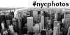
Location: New York City
Edit: Losing the frame and a better sharpness
__________________________
Nikon D300, Nikkor Lens 18-55mm @ f/25, ISO 100, 65 sec exposure
Hoya ND 400
Hoya ND X8
Edit: Losing the frame and a better sharpness
__________________________
Nikon D300, Nikkor Lens 18-55mm @ f/25, ISO 100, 65 sec exposure
Hoya ND 400
Hoya ND X8
Image size
1280x850px 578.33 KB
Make
NIKON CORPORATION
Model
NIKON D300
Shutter Speed
655/10 second
Aperture
F/25.0
Focal Length
20 mm
Date Taken
Aug 7, 2007, 1:51:27 PM
© 2008 - 2024 YOSHIMETAL
Comments254
Join the community to add your comment. Already a deviant? Log In
Without the crosswalk signs, although completely unoriginal, this image is incredible as a simplistic architecture shot.
It has an amazing dynamic range, wonderful tones, the sky looks like a pastel drawing. The building itself has great convergence, I hate architecture shots that try to fix perspective... that's boring. The mix of highlights and shadows on the buildng is very nice, and the reflections are lovely. This is an image that seperates itself from its cluttered NY surroundings and becomes a thing of simplicity and beauty.
Or at least it would have separated itself from its cluttered surroundings if it were not for that shameful inclusion of all that junk in the bottom right hand corner. That, in a blink of an eye, completely ruins the shot.
I wish you could have stepped five feet to the left, and taken the same shot with the sky on the right balancing out the building on the left. As it is, you've included a chaotic junk pile of steel and glass and messy angles that just gash the pristine, geometric cleanliness that was a very simplistic image. You took something that had wonderful attributes and ruined it with an awful compositional oversight.
Maybe if the crosswalk crap wasn't splattered right overtop the building it would be more bearable, perhaps it would cause a balancing of the image, but especially shoved right on top of what should be the main focal point, causes it to steal the focus (especially with the blown highlights).
It doesn't lend a single thing to the image other than to cause me to think, 'I can't fucking believe it, this would have been such a fantastic image, why why why this bullshit?'
<img src="e.deviantart.net/emoticons/f/f…" width="15" height="15" alt="